Nutaku Android Store Update: Introducing Library and More

- Nutaku
- 2021/02/09

With our latest release of the Nutaku Android Store app last week, we have introduced a few new big features and made some interface changes, all of which are intended to make the experience of using our Android app easier and more enjoyable. In this article, we will go over those additions and changes while also sharing some of the reasonings and insights that drove them.
This article also marks the first of our ongoing series of design insights articles: where we dig just a little bit deeper into some of the things that we’re working on, or have recently released. We plan to release these every now and then, so keep your eyes open in the News and Updates section, and feel free to share your thoughts about these on our Discord server.
Summary (TL;DR):
In the latest update we changed or added the following...
- New Library page:
A dedicated place to access games already available to play or install, and check ongoing downloads. - “Me” page is gone?!:
Not quite! The “Me” page has been moved from the bottom navigation to the top rightmost part of the screen, next to the new search bar. - New search bar and Nutaku logo:
The search bar is easier to see and use, and the Nutaku logo allows for quick access back to the home page. - Other overall design improvements:
Improved download progress indicators, clearer buttons, and less overall tag clutter.
You can download the new Nutaku Android Store here, or if you already have the app installed it should update the next time you open it up!
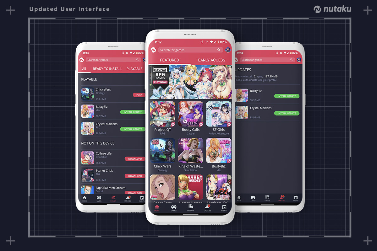
New Library Page
The introduction of the Library page is by far the biggest addition of this update in terms of overall changes. The Library page, as the name suggests, is a dedicated page for users’ to access their library of games. It contains all games that are already available for play, games that have been downloaded but still need to be installed, and games that are currently being downloaded. It also includes a list of games previously linked to the user’s account, but that aren’t on the device. This page can be easily accessed through the “Library” tab now on the center of the bottom navigation.

This page was created mainly with the intention of making it easier for people to keep track of their game downloads. Before, if someone wanted to double check what they are downloading in the app it would require them to navigate to a game’s download page, or search for that game again in the entire catalog. While this was “ok” for people downloading a single game at a time, it was a much more difficult experience for someone that was downloading multiple games at a time. Now, anyone can quickly access their in-progress, and completed downloads, via the Library tab.
In addition to this, the Library page also contains the games that are already available to be played. This list of games was already previously accessible through the home page, via the “My Games” sub-tab. Moving that list of games to the Library tab seemed to make more sense for us, as it is now in a more easy to see and access location in the app, helping those that decide to launch their games through the Android Store app.
Finally, the library also contains a “Not on This Device” section, which lists all games previously linked to your user account but that aren’t, well, installed on that device. This section is meant to help those that want to quickly find all games that they have previously installed, without having to hunt each game individually. We believe that this will be quite helpful for people that don’t have a lot of storage and are returning to a game after a break, or those that have completely changed their devices and need to download and reinstall multiple games.
“Me” Page is Gone?!
Not gone, no. But the “Me” page which was accessible through the “Me” tab in the bottom navigation has moved to a different location, now on the top rightmost area of the screen. It still behaves mostly like before, just the means of accessing it has changed.
This change was motivated by two reasons: first, this update introduced the new Library page, which we believe is a highly pertinent new page for all users. With that in mind, we have dedicated a spot for it on the bottom navigation of the app. With an additional tab in there, we thought that it was best to bump something out of it to avoid keeping that area too full of stuff, which would make the experience of navigating through the different pages a bit harder.
And second, we come to the realization that moving it to the top rightmost area of the app would actually be an improvement in making it easier to find and access. Displaying a user’s profile photo on the top right region of a page has been a recurrent design pattern seen all around on the web, from social media websites all the way to productivity apps.
Making use of that pattern on our app as well means that we can make the overall interaction more consistent with other apps and websites, which in turn makes the experience for new and returning users more seamless, as they are more likely to find this page and recall where it is in future visits.
New search bar
In addition to the old “Me” tab now being displayed in the upper area, the search also received a significant update, from being previously a simple icon to now sporting an entire input field, displayed in the top and center. With this change we hope to make the search functionality of the app clearer, and also a bit easier to interact with (folks with big hands, rejoice!).
We have also moved the Nutaku logo to the top left, and made it interactable. This is a very minor change, but provides another way for users to quickly return to the home page if they so wish. The Nutaku UX team is a big proponent of making use of redundancy on important elements and links. We feel that giving users multiple ways to accomplish important actions when using our platform is never a bad thing, as this should improve the overall accessibility of the platform, and make it a bit easier for everyone to use it.
Other overall user interface improvements
We have also made a plethora of other smaller design changes. Those with keen eyes will notice some changes to fonts, buttons, wording, among others. One of the bigger changes is on the presentation of “Downloads In progress”, which now uses a circular progress bar, being more consistent with what other download managers use when compared with our previous approach.
All in all, all those changes try to remove potential points of confusion, and make it a bit more easy for users to find the information that they are looking for without getting lost or confused along the way.
In closing...
We are excited with these new additions to the Nutaku Android Store app, and we hope that overall they bring a better experience to all our awesome players! We still have a couple more things planned to be released soon for the app, but we won’t be able to talk much about it until we are a bit closer to the release date of these other big updates.
As always, if you have any feedback regarding your experience with Nutaku, feel free to hit us up on any of our social media. Let us know what you think about our Design Insights series and what you would like to hear more about!